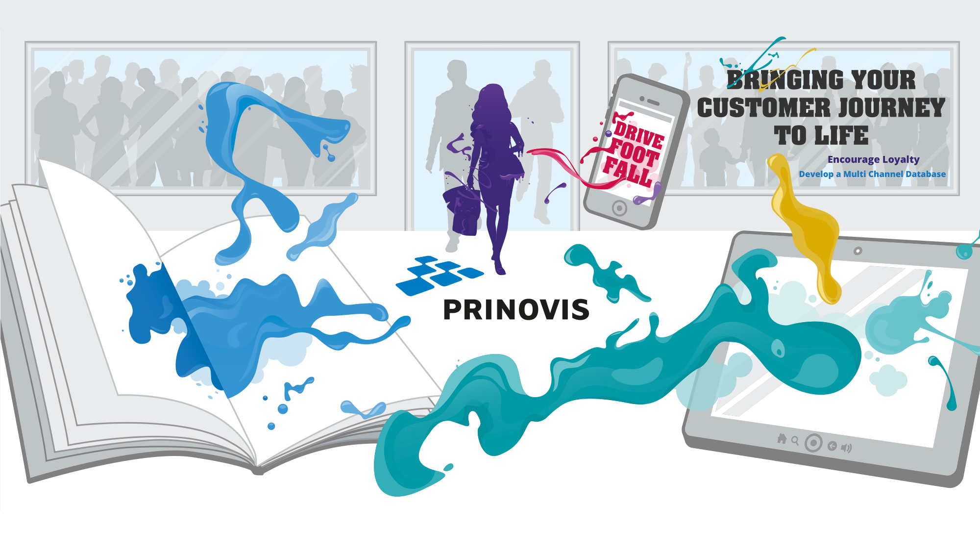
One of the largest Gravure Printing companies in Europe, Prinovis, liked our last exhibition stand design so much… they came back to us for their next one! The In-Store Marketing Show, London has attendees from a wide variety of retail sectors. Our client wanted an exhibition back wall design to make them stand out!
The project brief was to promote how multiple location retail outlets should consider a multi-channel approach when planning their sales and marketing activities. This project was produced in conjunction with our Prinovis magazine design project; both part of the same campaign: ‘Bringing a Customer Journey to Life’.
The initial part of the brief was to conduct a creative strategy meeting with Prinovis, who are based in Speke, Liverpool. The strategy meeting gave us the opportunity to establish the exact message which we then needed to communicate through the design.
Our initial concern at this stage of the project was the possibility of mixed messages occurring through the combination of online and offline promotions – using them both in the one campaign.
We presented a final idea of ‘Bringing Products to Life’ which the client really liked. This was developed further into ‘Bringing the Customer Journey to Life’. The concept idea was to illustrate a retail themed background, utilising a flat silhouette environment and then apply a burst of colour, springing out of a tablet, mobile device and a retail catalogue.
Our use of colour signifies both mediums being ‘brought to life’ – ultimately enhancing the customer purchasing journey. The eruption of colour acts as a fountain of energy, engulfing the (previously) monochrome retail consumer, also in the image.
The stand space was slightly smaller in length than our last project, coming in at 5m wide x 2.5m tall. The Prinovis logo remained central within the exhibition design, signifying that Prinovis is the source and driving force of both online and offline types of media.
Visitors to the In-Store Marketing Show exhibition will be met by this large illustrated back wall art, filling the complete Prinovis stand. The main objective for our graphic design team on this creative piece was to come up with a visually striking image – without being too obtrusive. And to have just enough thought provocation to arouse a positive curiosity.
Overall, the client was very happy with the outcome, and so were we!


